Build and sustain BUSINESS quality – different from product/service quality (28)
 Kim Warren
Customers who deliver more sales; products that reach more customers; staff with more experience ...
Here’s another issue that senior leaders should pay attention to … and that your models can help with!
A friend working at a big confectionery business was puzzled. His business had 37 products [brands/styles/sizes] while the market leader had 23 … but its rival had more market share, grew more strongly, and was certainly more profitable.
How come? It turned out that it wasn’t the number of products that mattered, so much as the ‘quality‘ each product contributed to the business – specifically, how many consumers regularly bought each product, and how much profit that brought.
My friend’s business had often launched new products, expecting that these would capture consumers who didn’t buy their existing offerings. The big problem? – each additional product appealed to too ever-fewer additional consumers.
Let’s visualise it.
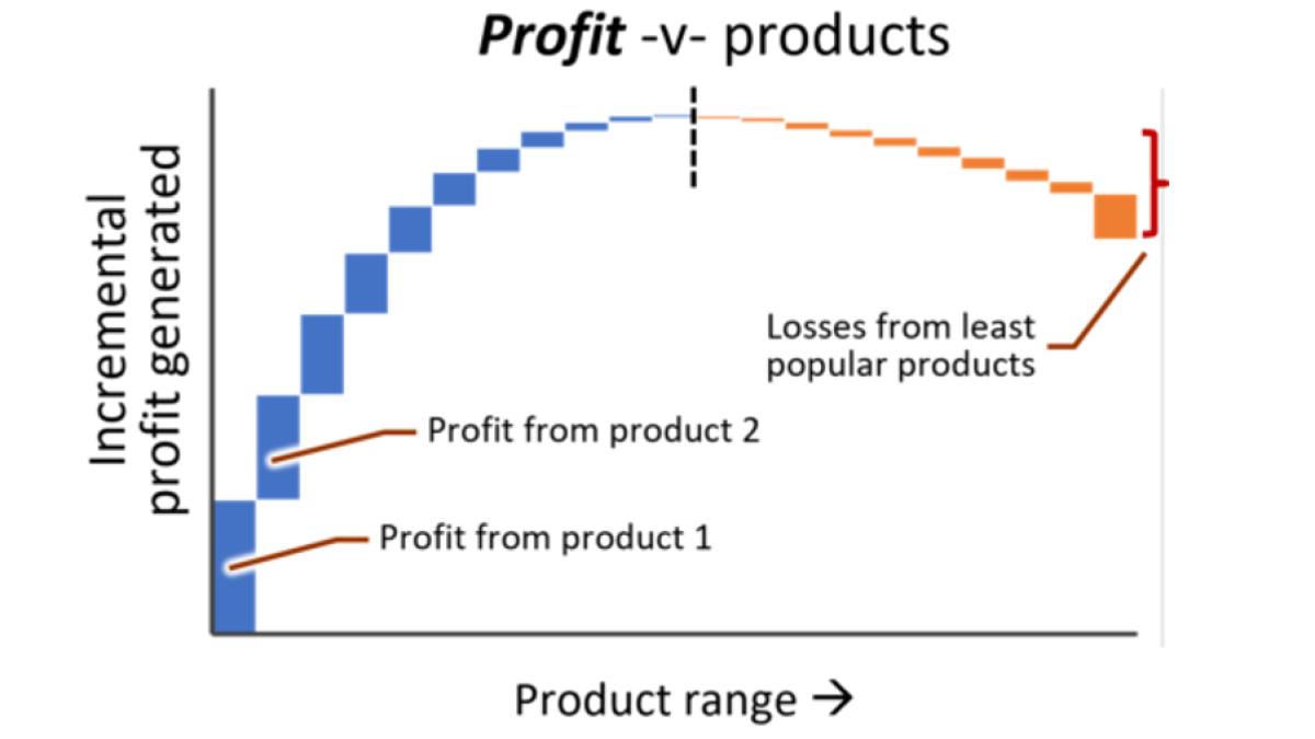
The figure below illustrates the problem.

The first column in the chart at left shows the customers reached by the most popular product. The second column shows how many customers are reached by the 2nd-most popular product … and so on until the last thin column showing all the customers reached by the ‘tail’ of all the least popular products.
(Note, by the way, that unlike nearly every chart I use, this one is NOT a time-chart – it is a point-in-time snap-shot of the quality-mix of the product range)
Now it is possible that even the least popular product generates some profit – but maybe not. After you have deducted all the incremental costs involved, you could have the profit result in the chart at right. Somewhere along the curve (at point ‘A’), those incremental costs could start to exceed the gross profit that a less-popular product generates. So that product actually makes a loss. Taken together, the least popular products are destroying your profits. (The final column shows the total losses of the remaining product ‘tail’).
Then there’s ANOTHER problem – even when my friend’s business thought a new product was capturing a good number of consumers, they didn’t spot that many of those consumers were switching from existing products. For the chart, this means that the first column (customers reached by the most popular product) could be larger, if it had not lost customers to later products!
Be careful!
The obvious solution here is to drop all products to the right of point ‘A’. But that is only correct if all the costs you allocated to those products can truly be saved. You will surely save the marketing promotion and costs of those products, and maybe you will save money with a smaller sales force and lower distribution costs. But you will likely not save much on IT or finance admin staff, or on premises or senior management.
So as I’m sure you realise, the chart at right must only reflect the true incremental costs driven by each additional product.
And there can be other solutions, like lowering the cost of supporting less popular products.
Wider uses for the “quality curve”
We can call the figure above a “quality curve” for the product-range resource, because it shows the profile of that business-contribution quality in an easily understood chart. But the product range is not the only resource on which this issue arises:
- Customers vary in ‘quality’. For customers, the chart at left would sum the incremental sales from each customer, and the chart at right would sum the incremental profits generated by each customer. (This, of course, is why we look for low-cost ways to serve smaller customers – to switch some of those orange negatives at right into additional blue positives).
- Intermediaries vary in quality – dealers, agents or – for consumer-product makers – the retailers and stores through which they sell. How many end-customers does each intermediary reach?
- For retailers stores vary in the number of consumers they reach and profit they generate. It is depressingly common for retailers to over-do their store expansion, not realising that from some point, every new store was only succeeding by stealing consumers from existing stores. (I blogged many years ago about the disastrous profit-hit Starbucks suffered after messing up on this issue!)
- Of course, staff also vary in ‘quality’, whether that’s the success-rate of sales people or productivity of support staff. However it is rare in that case for incremental staff to make a negative contribution to the business.
Avoiding the “quality curve” trap
Now fixing this problem for my friend’s confectionery business was tough! And it would take many years.
Better, surely, not to get into this problem in the first place?
_______________
We can easily model how the quality-mix of a product-range (or a customer-base, or any other resource) changes over time, and how the addition or removal of any item would change that quality-mix. Learn how to do that with class 5 of our dynamic business modelling course.
Get 20% off the full price, using the coupon blog20 at checkout.
Categories: : business performance, strategy